What is a Responsive Web Site?
It actually goes beyond just designing your web site for optimal rendering on a mobile phone or smartphone device, but more so on all possible screen sizes: mobile, tablet, desktop, laptop and even the big screen smart TV. What is your 3-screen strategy?
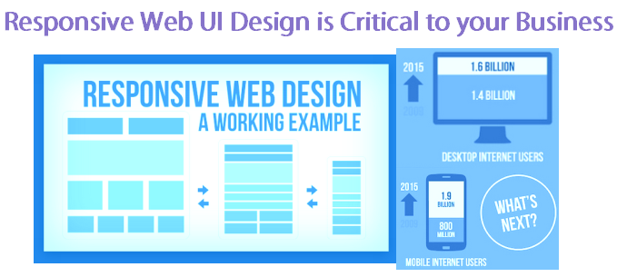
When designing your site, it is important to ensure that a clean and fluid layout is maintained throughout to cater for the smallest mobile screen size 6″ mobile device to the biggest 50″ big screen. This is called liquid layout and fluid layout in order to ensure that the site renders well, as well as is usable on whichever device is displaying the web site.
Important factors for responsive user interface design is:
Fluid Layouts and Grids
Percentage-based design that adapts to the page size accordingly. Also landscape versus orientation of the device for mobile phones and tablets.
Flexible Images
Images sized in relative units to prevent them from displaying outside of their containing element.

Parallax Scrolling
Background moves at a slower rate than the foreground as the user scrolls down the page. This is very important when being displayed on a mobile in portrait orientation. Done well, it can be extremely effective, but over use of this feature can lead to abuse and annoying for a business-centric web site that aims to inform, inspire and persuade to buy their product online. Not to mention it would be difficult for a business owner to track his web site traffic, trends and conversions with an infinite parallax scrolling design.
Media Queries
CSS stylesheets that contain user agent queries also known as media queries to detect the device type and screen size and to render the stylesheet and page template accordingly.
Responsive Navigation Menus
Navigation menus can either be sidebar driven menus, dynamic menus that render according to the displaying device – it is important that the optimal menu view is rendered for ease of use (usability), navigation-ability and more whether the screen is a touch interface, mouse-wheel driven or keyboard-driven – leading into the topic of optimal accessibility.
Contact Liapros for more information on responsive web site design, and how you can ensure that your business is future-proofed to evolve with the changing times of technology.