
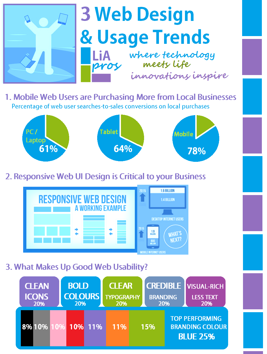
Lia Productions has released it’s 2015 Web Design & Usage Trends Infographic that proves to you that a mobile responsive web site is critical to the success of your business. Liapros is all about getting ahead of emerging trends, making predictions on market behaviour, demographic shifting, generation gaps, usability and much more. Leveraging future predictions and emerging trends when launching a new business, product or innovative idea is critical to success as market timing is crucial.
 What is all the fuss about Mobile Friendly Web Design?
 Known as Responsive Design.

It actually goes beyond just designing your web site for rendering on a mobile phone or smartphone device, but more so on all possible screen sizes: mobile, tablet, desktop, laptop and even the big screen smart TV. What is your 3-screen strategy?
When designing your site, it is important to ensure that a clean and fluid layout is maintained throughout to cater for the smallest mobile screen size 6″ mobile device to the biggest 50″ big screen. This is called liquid layout and fluid layout in order to ensure that the site renders well, as well as is usable on whichever device is displaying the web site.
Important factors for responsive user interface design is: parallax scrolling, mobile-friendly menu navigation menus with respects to left sidebar hide and seek primary navigation menus. One URL, one content server, one code base, multiple user devices with pixel width ranges of 460 px to 1920 px. Find out more about What is a Responsive Web Site.

Contact Liapros for more information on responsive web site design, and how you can ensure that your business is future-proofed to evolve with the changing times of technology.